discover the new look of nuggela & sulé
A transition to a more mature phase, as an established company in the hair care market.
Designs that embody scientific innovation alongside a connection to nature and tradition, expressed through our corporate pattern, natural colours, and ingredient icons.
Over the years, we have expanded to more than 30 countries and received numerous awards, thanks to our high-quality products, supported by clinical studies.
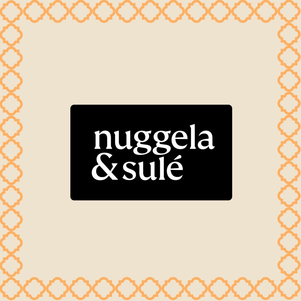
The redesigned logo is set against a black rectangular base, featuring a serif lowercase typeface that conveys a sense of tradition and warmth. The two-line composition results in a more compact logo, perfectly suited to contemporary digital formats.
Key graphic elements have been reintroduced and updated, including the orange pattern, inspired by old botanical manuscripts, which continues to be one of the brand’s most distinctive features.
Moreover, minimalist illustrations, drawn in a single line, have been introduced with the main purpose of representing the natural ingredients used in Nuggela & Sulé products, strengthening the visual link to their commitment to both natural and effective solutions.


Labels and packaging follow the same design structure.
1. The fluorescent orange pattern in the background, with the logo always placed in the top left-hand corner.
2. A central section featuring all the product information: what it is, direct benefit, distinctive colour block, ingredients…
3. At the bottom, secondary information detailing key benefits and highlights, accompanied by a line drawing of the main ingredient.
A more refined brand with a stronger presence at the point of sale. We’ve highlighted the corporate colours, orange and beige, to make the product range stand out, presenting a much cleaner, more consistent, and coherent appearance.

